Monday, 7 December 2009


Welcome to the official blog of 'Rhythm' magazine. 'Rhythm' is a monthly R'n'B, music magazine that provides readers with the latest information, reviews and interviews on their favorite artists and bands.

Purpose and intention of magazine:
The purpose and intention of my music magazine 'Rhythm' is to produce a reasonably good standard magazine based around the R'n'B genre of music. The intention is to inform people on an interview with an R'n'B band. The genre of music relates to the images and text, and this is all formed around youth culture. Once I interviewed people about what features they thought were important to a music magazine, I understood more about what I needed to put onto my magazine


Logo Planning and Masthead analysis:

This is my logo planning which helped me to chose which fonts, colours and also what text would be appropriate for the target audience of my music magazine.
These are three mastheads I looked at, and analysed at the start of looking at how to produce a music magazine. It helped me to understand what would attract the readers attention and also what would be appropriate for both the target audience and for a music magazine.
Music Magazine 'Rhythm'


Preliminary Task- School Magazine:
Double page spread images: 

This is one of the images frommy double page spread. I chose to analyse this image because I think it says a lot about the music magazine and the actual features in my magazine. It shows a young girl; the new member of the band. She is wearing a hood and lots of bold, statement-making jewelery. This image can contribute to helping the reader infer about the genre of music and attitude of the band. She is also wearing a hood which challenges the conventions of a usual 'pop' magazine.


These are two other images from my contents page and i kept them as actual images instead of making them black and white like I did with the main image. The colours are dimmed slightly and they are nearly opaque. They also merge into eachother and by this I think it looks quite 'youth-like'
Contents page images:
This is the main image for my contents page. It shows a member of the band 'in the middle' of playing the guitar. I took it at a high angle to give the reader the sense of 'we were not supposed to see this'. On my actual contents page, I made the image black and white and merged it into the background so that the image is not like a clear photo. The image can still be seen however and is part of the background. 


Add Video

Sunday, 6 December 2009


Music magazine research:


I used 'VIBE' magazine to do my research and also to give me inspiration when creating my own music magazine. I used 'VIBE' as it displays R'n'B music, which is the genre I based my music magazine on, therefore I thought it would be relevant to look at a magazine which covered the same style. The target audience that the magazine 'VIBE' is aimed at, is the same as the target audience I aimed my magazine at, which is another reason I chose to do research on it. The colours used on the 'VIBE' magazine cover, are very basic, cool and calming. They also relate to the 'youth' of the magazine. Like the music magazine I created, 'VIBE' used a close head shot of the female artist, maybe to represent youth in itself but also the true meaning of the music behind the celeberity. I chose to use a close head shot, to challenge the usual stereotypical images and poses of teenagers. I thought it created quite a calm atmosphere among the page, calm yet urban and funky!

The head shot image could also make the reader feel more involved with what is inside the magazine.

Build up of music magazine:

Front cover image:

This is the original image from the front cover of music magazine. I chose to use this image as I think it best represents the genre of music which my magazine is based around, and it also seems like it could correlate with the target audience, which is teenagers of around 15-19, because of what the girl in the image is wearing, aswell as her accessories and her pose.

Looking back at your preliminary task, of designing the front page of a school magazine, what do you feel you have learnt in the progression from it to the full product?

I completed the preliminary task before I started producing my music magazine, so that I could use any skills gained along the way, and put them into use with my real project. For the preliminary task, I created a front cover and contents page for a school magazine. On the front cover, I found that I had to keep things quite limited in terms of font and language. The audience for my school magazine, were students who attend 'Acland Burghley School' therefore, I thought it was appropriate to use a sensible font and to use relevant language. The image on the front cover of the pupils, was taken as a high-angle shot. I chose to show that the school/college is known for having a speciality in 'Arts' such as; Performing Arts, Technology and Art itself. I showed this by the variety in colours used for the masthead. From the duration of starting my preliminary task, and to completing my final product; my music magazine, I learnt that colour and font are two important features when creating and forming a magazine, especially when the target audience can be very specific about what they want to get out of a magazine, therefore you as the creator need to acknowledge what would be most appealing.
Creating both the school and the final music magazine, were quite easy, but I did have some difficulties. I learnt a lot from creating the school magazine, and I realised that mistakes I made with the preliminary task, did not occur with the final product. I found that completing the preliminary task, helped me to complete the music magazine, as I was clearer on what I could do better and make more appealing, as I had a specific audience. Overall though, I am happy with the outcome with both the preliminary task and my music magazine.
What have you learnt about technologies from the process of constructing this product?

During the process of constructing my product, I used a wide range of different technologies. Firstly, I learnt how to use a whole new computer system, 'Apple Mac' which at the beginning was quite hard to use. I began trying to use the publication; 'Adobe Photoshop CS3' for the first time which was very tricky, but once i got used to editing and applying new extras to my front cover, I found that I was using the workshop much easier, and at a much quicker pace. I used photoshop to add images and adjust them in various ways, like changing the size, rotational direction, facing and also to add certain effects so that once the images were added to my music magazine, they would look aesthetically pleasing to the reader, and it would attract the correct target audience, which are teenagers or young adults around the ages of 16-19.
I then learnt to use 'Pages' to construct the pages of my double page spread. I found this slightly easier than 'Adobe Photoshop CS3' because it was more straightforward and easier to edit text but only once it was dragged from another program. I also found adding effects to the images and text on the double page spread easier than 'Adobe Photoshop CS3'. It allowed me to add glowing effects, mirroring and different facings of the images.
Also, I learnt the difficulties of using a digital camera, which was supposed to be one of the easier tasks but a lot of patience was needed for my images to be taken correctly at the right light and angle, and also for them to download onto the computer.
How did you attract/ address the audience for your music publication?

To start with, I used a number of things on my front cover which could lead to drawing the reader in or attracting them, things such as a 'Free C.D' and 'hot posters'. This would help to persuade the reader to purchase my music magazine. I had to think about using appropriate fonts, images, colours and language to appeal to my target audience. The colours I used mostly were both light and dark blues, with bright red and white. This challenges usual conventions of an R'n'B/ 'pop' music magazine, as these colours would not be as obvious on current music magazines. However, as I am interested in these genres of music as a girl in the middle of the age range, I think my music magazine could appeal to quite a lot of other teenagers, who are also into the same type of music. I also focussed on how I spoke to the reader through my magazine, for example short sentences which were quite straightforward.
Who would be your audience for your music magazine?

The target audience for my music magazine 'Rhythm' would be teenagers/ young adults, aged around 15-19. There isn't a specific gender that my music magazine is aimed at but it would only interest teenagers who are enjoy the genre of music which my music magazine is based on, which is R'n'B and 'pop'. The audience are from a range of areas in London, and are likely to hold a part-time job. They may also come from households with an average income. They are likely to be frequent users when it comes to using and surfing the internet and listening to music under the relevant genres.
Looking at the front cover of my music magazine from an outsiders' point of view, they might suggest that my magazine is predominantly for females because of the colour scheme of light blues and lilac. I think the target audience for my magazine, is specified quite clearly through the use of text as I have used quite urban fonts the whole way throughout my magazine. Also, there is use of some colloquial language and quite inviting punctuation such as exclamation marks!

What kind of institution might distribute your music magazine and why?

The target audience for my music magazine is teenagers/ young adults therefore distributing my magazine in public places like popular supermarkets and/or corner shops, would be a good idea as my magazine could get published widely and would be easy to purchase. To start off by publishing my magazine and selling it through small convenience stores such as local corner shops and maybe some supermarkets like 'Morrisons' or 'Sainsburys', would be a good way to familiarise people with my music magazine. Then, shops such as 'Borders', 'Waterstones' and 'WHSmiths' could be a good way to publicise my music magazine to a much wider audience.

Friday, 4 December 2009

How does your music magazine represent particular social groups?

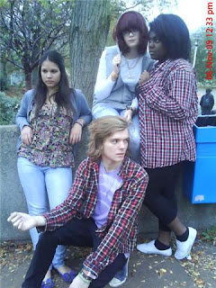
In my music magazine, the images I used represent a typical, teenage band. As the genre I chose was R'n'B and 'pop' i wanted to give quite a unique and funky feel to the magazine. The image on the front cover is of a girl, new member of the band 'BEATZ!' and even from the close up head shot, there is a lot of information that the reader can infer from it. I used the image in a stereotypical way, and challenged it by the use of costume worn by the girl in the image and the angle and pose of the girl. The image is of the new member of the band, wearing a grey hood and a lot of gold jewelry which represents quite an urban look. In terms of costume, because i used a mixture of one male and three females in my band, i chose to have the band member wearing quite quirky clothes to represent youth and diversity. This was also because my music magazine is based on the genres of R'n'B and 'pop'. Another feature that the costume relates to is the target audience, as they are around this age as well. This will draw the reader in and attract them to looking at the magazine.
Whilst taking my pictures of the imaginary band members, I had to keep relating back to current music magazines such as the ones mentioned before, to make sure that the images i was using were appropriate for the style of the magazine. Each shot I took of the members, had to be carefully thought out and I tried to make sure that I used a wide range of different angle shots. By doing this, it would interest the reader as the front cover could look quite appealing and attractive.
In what ways does your music magazine use, develop or challenge forms and conventions of existing music magazines?

To start with, when deciding what type of music magazine I wanted to create, the important things I needed to think about were, what makes an appealing magazine. I had to do a lot of researching and deconstructing each aspect of a music magazine. From looking at and researching current music magazines, I saw that each one followed different conventions that reflected the specific genre, and I gained inspiration and noticed that for the audience i was targeting my own magazine at, I needed to put a lot of work into making the front cover very attractive and aesthetically pleasing to the eye, as this is the main theme that attracts customers to purchasing a magazine of any sort. I started by looking at music magazines such as 'VIBE' and 'KERRANG'. Both front covers were packed full of eye-catching information and bright, bold and vibrant images as well as fonts. Mastheads were the main element on the front cover that seemed to give off a lot of information, such as what genre of music the magazine is based on and who the magazine is targeted at. I then tried to make my masthead with suitable colours and an appropriate font for the ideal audience and the field specific genre. For the genre of music for my magazine i chose 'R'n'B' but also wanted it to have some aspects of 'pop'.
Next, I looked at the images and the graphology. The way in which certain images and pictures were placed complimented other parts of the page, like the text. Some images were overlapping, blurred out, reflected and often edited with bold outlines to emphasise the main features of the magazine. A lot of the music magazines I researched used more than one image on the front cover, however, for my front cover I chose to use one image. The image i chose was taken at a close up angle. The images I looked at seemed to give the reader a clear idea of what was to be expected inside the actual magazine, which is the impression I tried to give with the way I photographed my front cover image. It also gives the reader an insight to what the image is about and has to do with the magazine.
Thirdly, the text which was placed on the front cover of the magazines, was an important feature to have. This text had to be short and subtle, but also to the point. A lot of the music magazines i researched which were aimed at teenagers/young adults, often used a lot of colloquial language. The text on my front cover needed to be informative but not tell to much of what was inside, to give a sense of drawing the reader in, and wanting to purchase the magazine.